Engage: Designing for Vulnerability — A Behavioral Health App for Young Adults
Designing a mental health and substance abuse resource app for young adults — as the sole UX/UI designer on an agile team
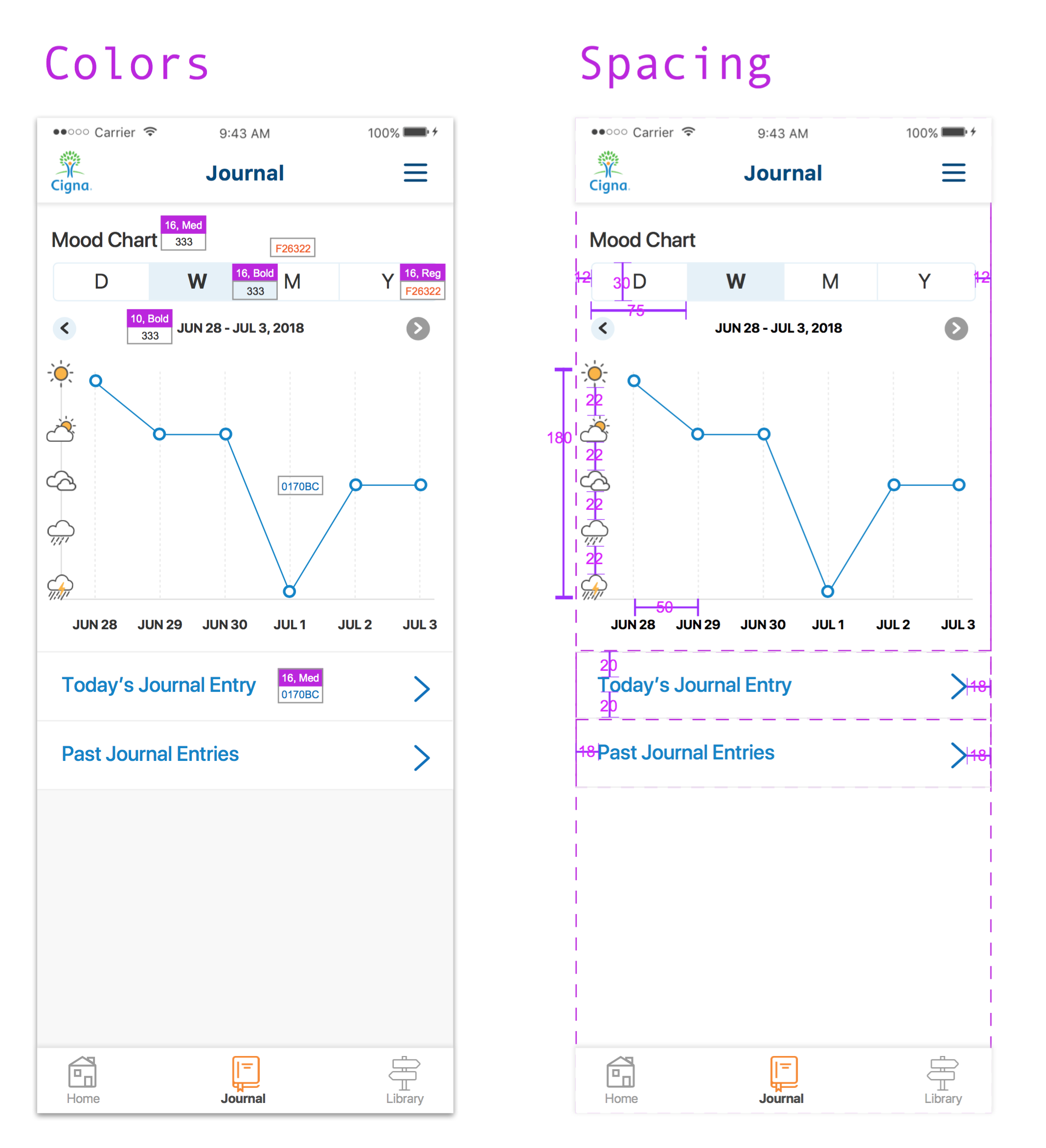
Organization: Cigna
My Role: Sole UX/UI Designer — design direction, ideation, wireframing, regulatory navigation
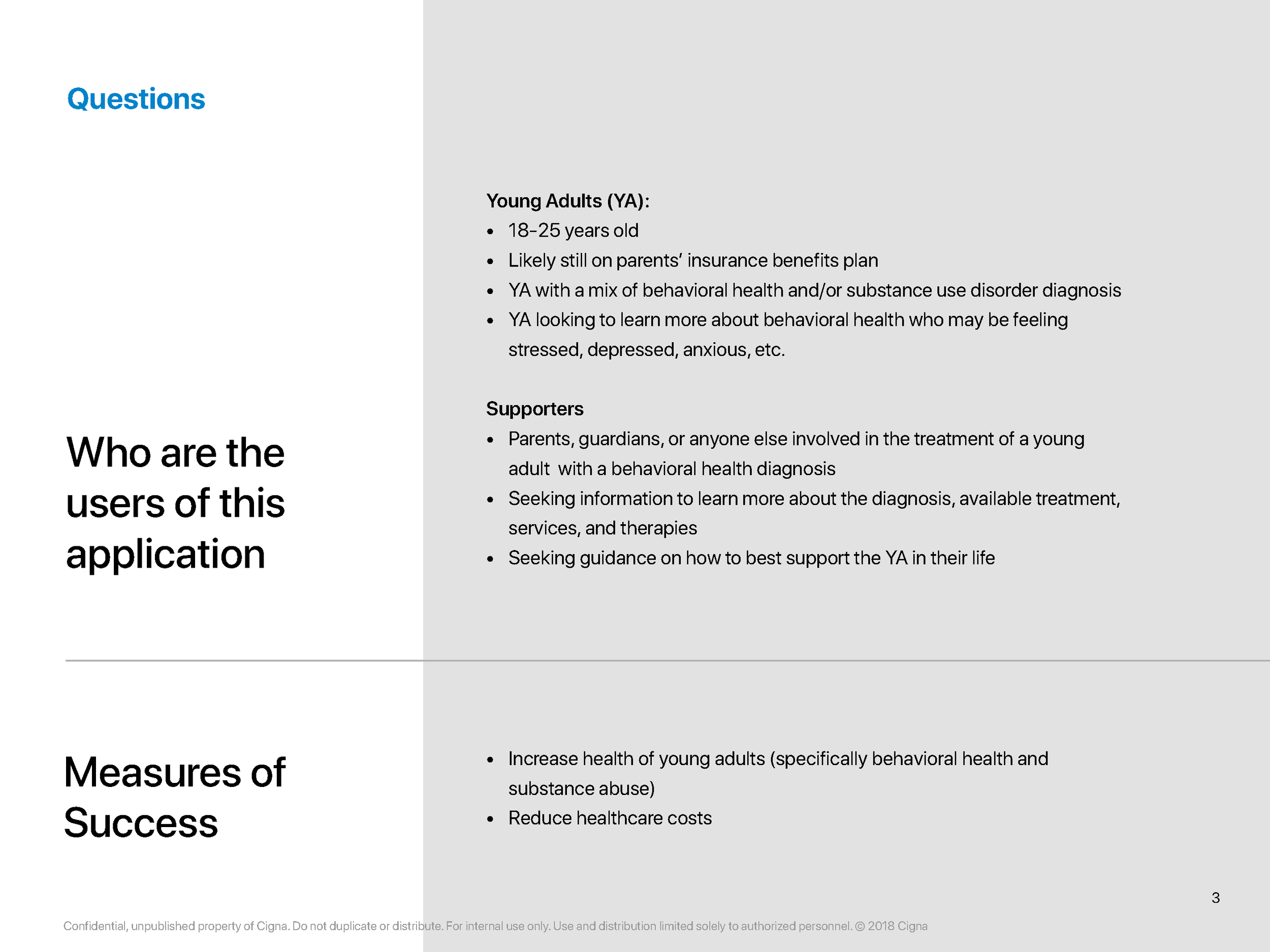
Users: Young adults (18–25) experiencing behavioral health and/or substance abuse challenges; healthcare support staff
Background
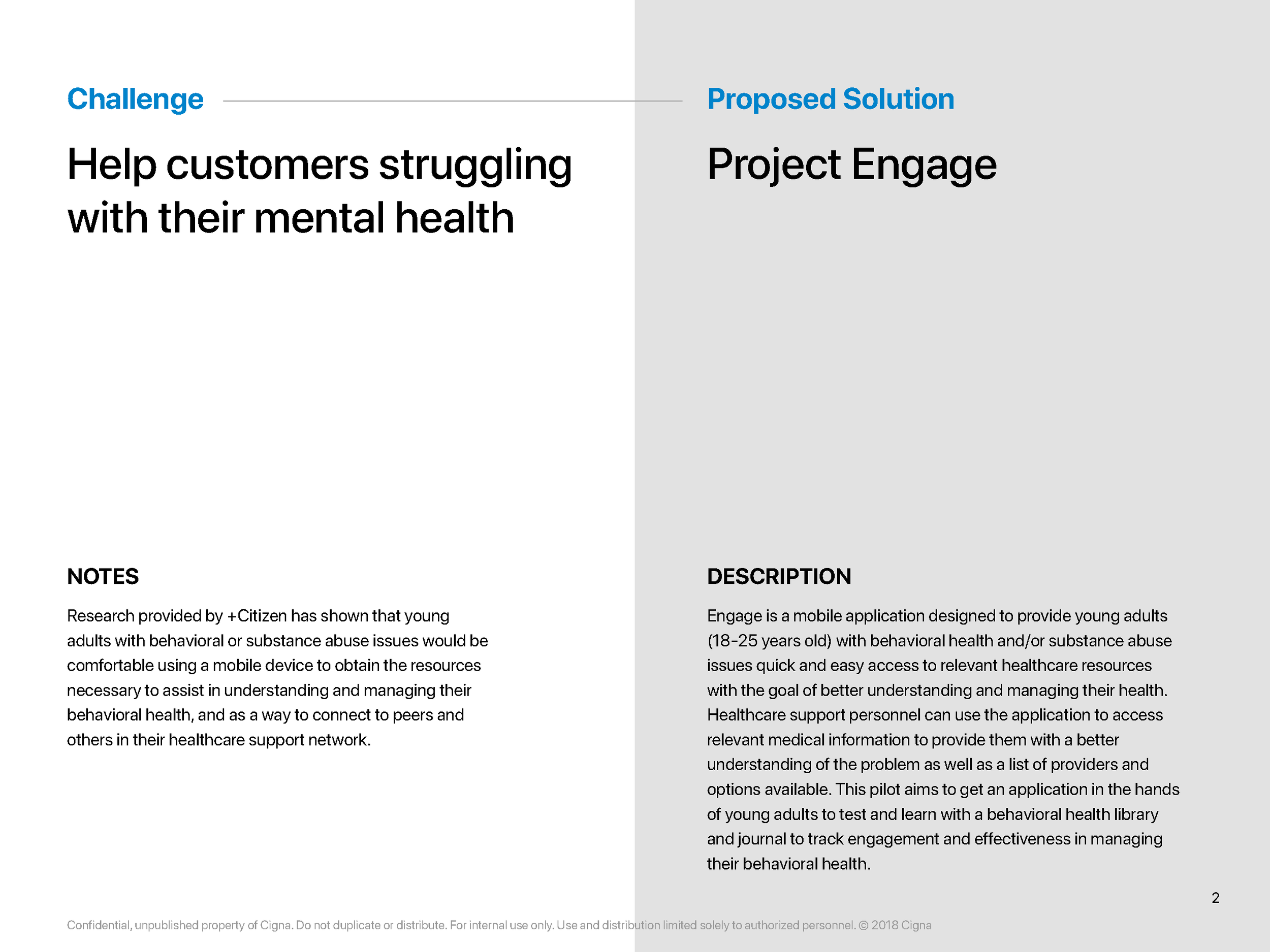
Young adults navigating behavioral health or substance abuse issues face a particular kind of friction: the gap between needing help and knowing how to access it. Cigna identified an opportunity to meet this population where they already were — on their phones — with a tool designed specifically for their needs.
Engage was a proof-of-concept mobile application with two audiences in mind. For users, it offered quick access to healthcare resources, peer connection, and tools for understanding and managing their own health. For support staff, it surfaced relevant user-provided medical information and enabled tailored provider and treatment recommendations.
The Problem
Vendor research confirmed what many in behavioral health already suspected: young adults with behavioral or substance abuse challenges are open to using mobile tools to manage their health and connect with their care network. The question wasn't whether to build — it was how to build something that would actually serve this population well, without overwhelming a small team or running into regulatory walls.
An internal team moved to pilot the concept, and I was brought on as the sole designer.
My Role & The Team
I was the only UX/UI designer on a cross-functional team of four developers, a scrum master, and two business partners. That meant I wasn't just executing designs — I was actively shaping design direction, contributing to product decisions, and serving as the bridge between business intent and user experience.
When complications arose or the business team introduced new feature requests, I was the one working through the design implications in real time.
Approach
The vendor research we received included basic wireframes — a starting point, not a solution. From there, the team made a deliberate scoping decision: prioritize depth over breadth, and focus development energy on two core features first.
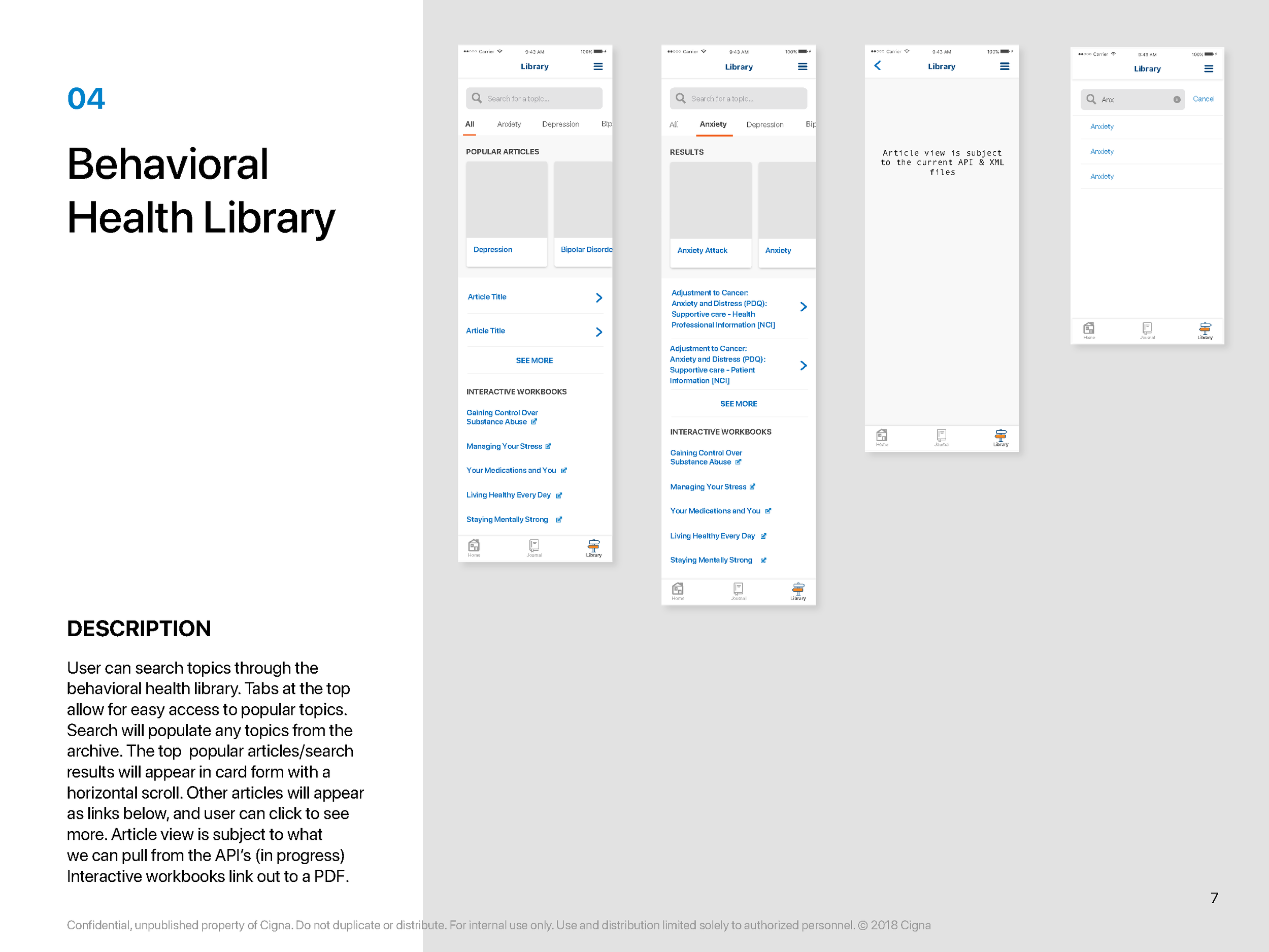
Behavioral Health Library — A resource hub giving users accessible, organized information about behavioral health and substance use, designed to inform without overwhelming.
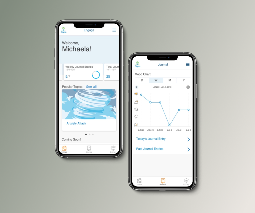
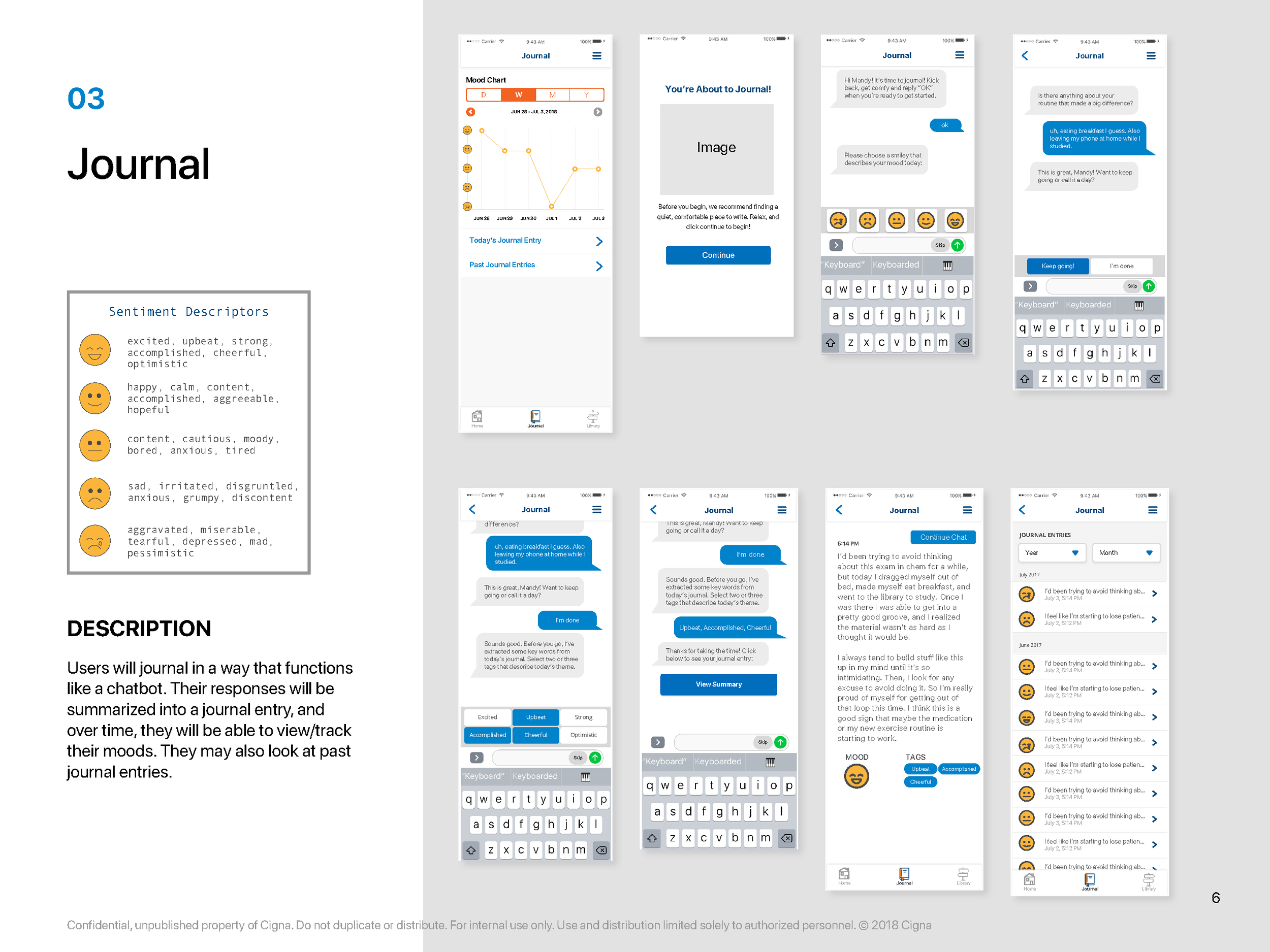
Journaling Feature — A private, user-controlled space for tracking mood, experiences, and progress. Journaling is an evidence-supported behavioral health tool, and embedding it in the app kept users engaged between support interactions.
Beyond these two pillars, the team identified additional features that would require close coordination with legal — specifically around HIPAA and FERPA compliance. Designing for a healthcare context with a young adult population means privacy and data handling aren't afterthoughts; they're structural requirements that shape every interaction flow.
My specific design focus included:
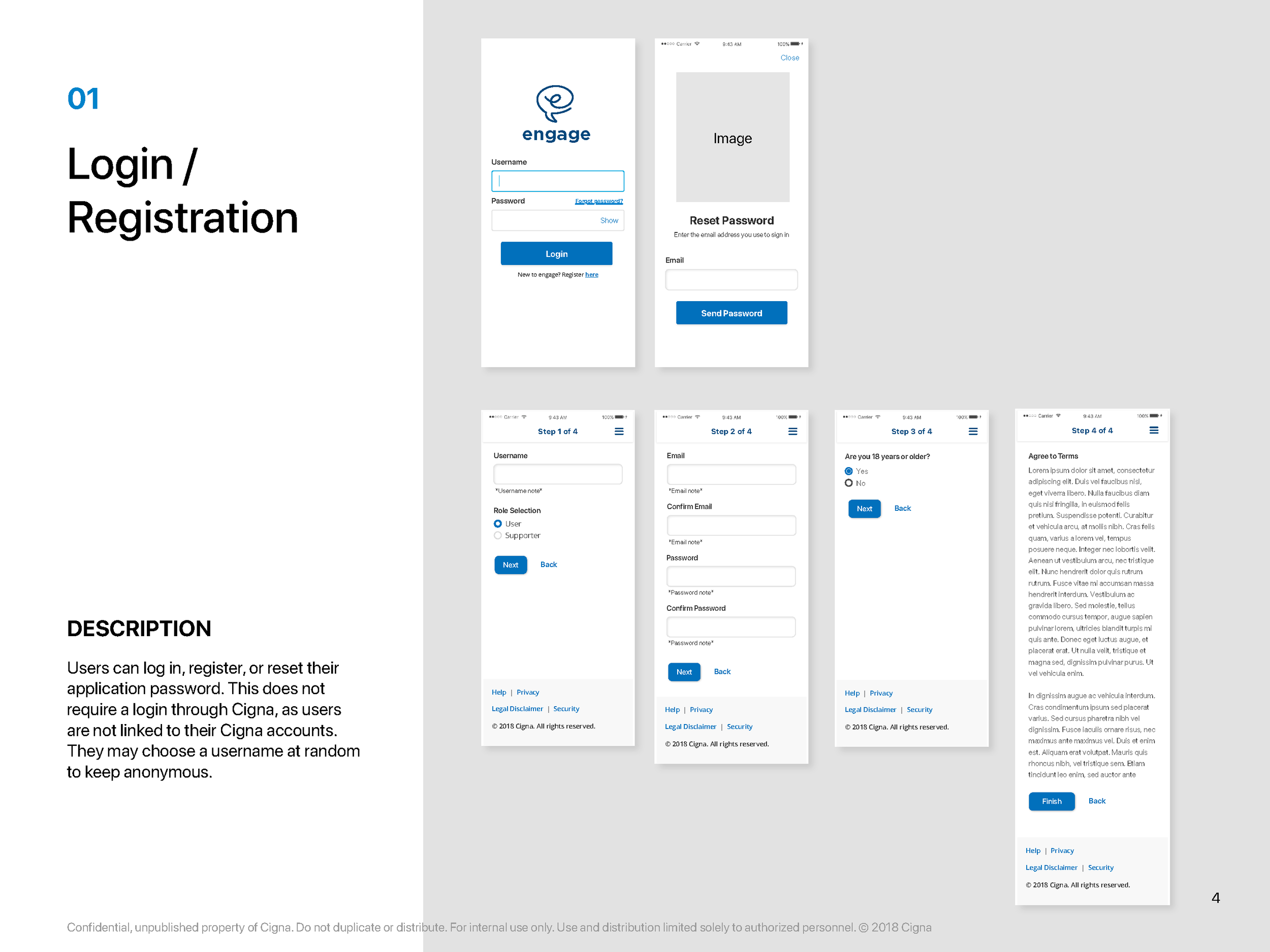
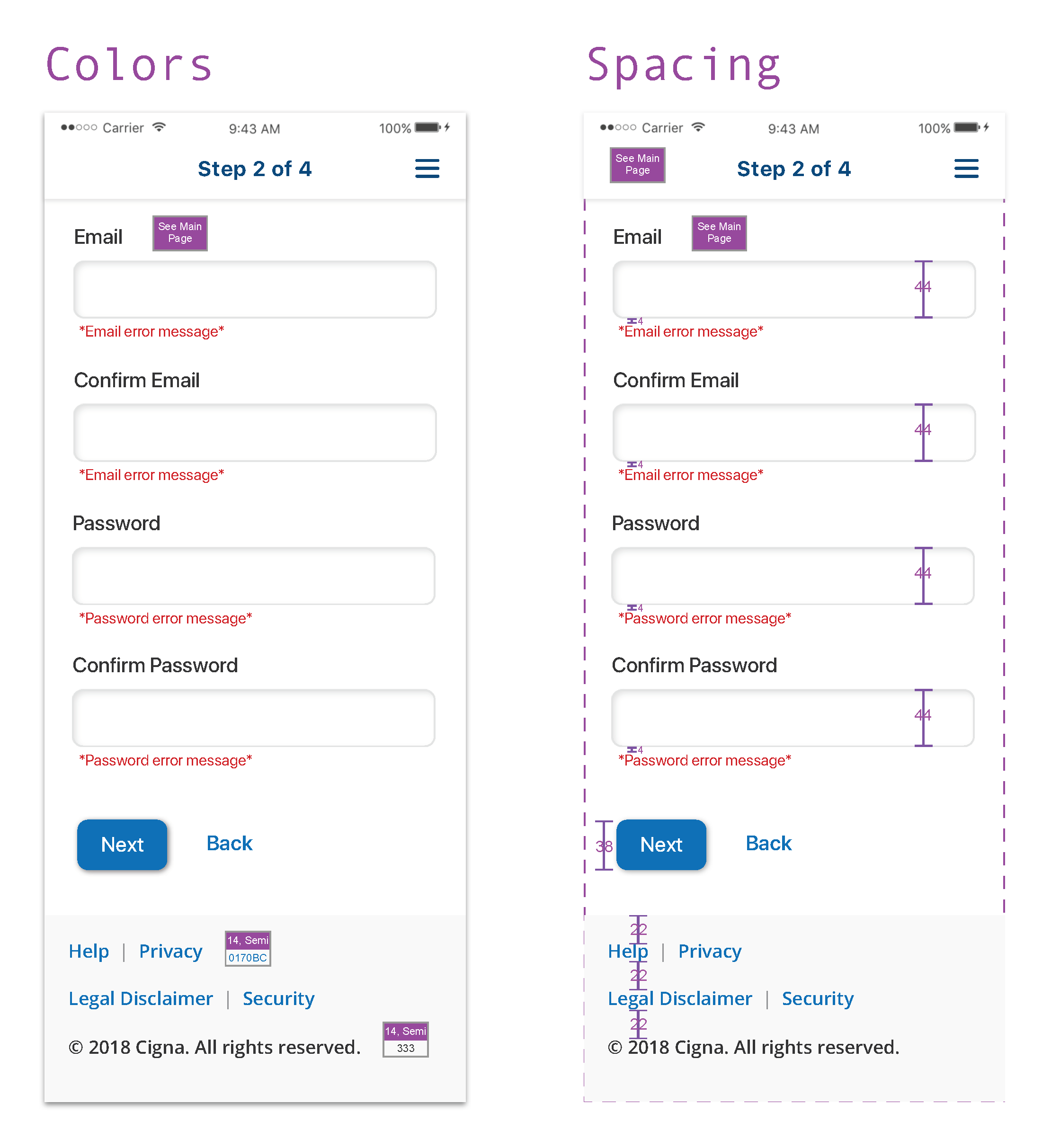
Registration flow — Setting the right tone from the first interaction, balancing necessary data collection against the reality that this population has low tolerance for friction and high sensitivity to feeling surveilled
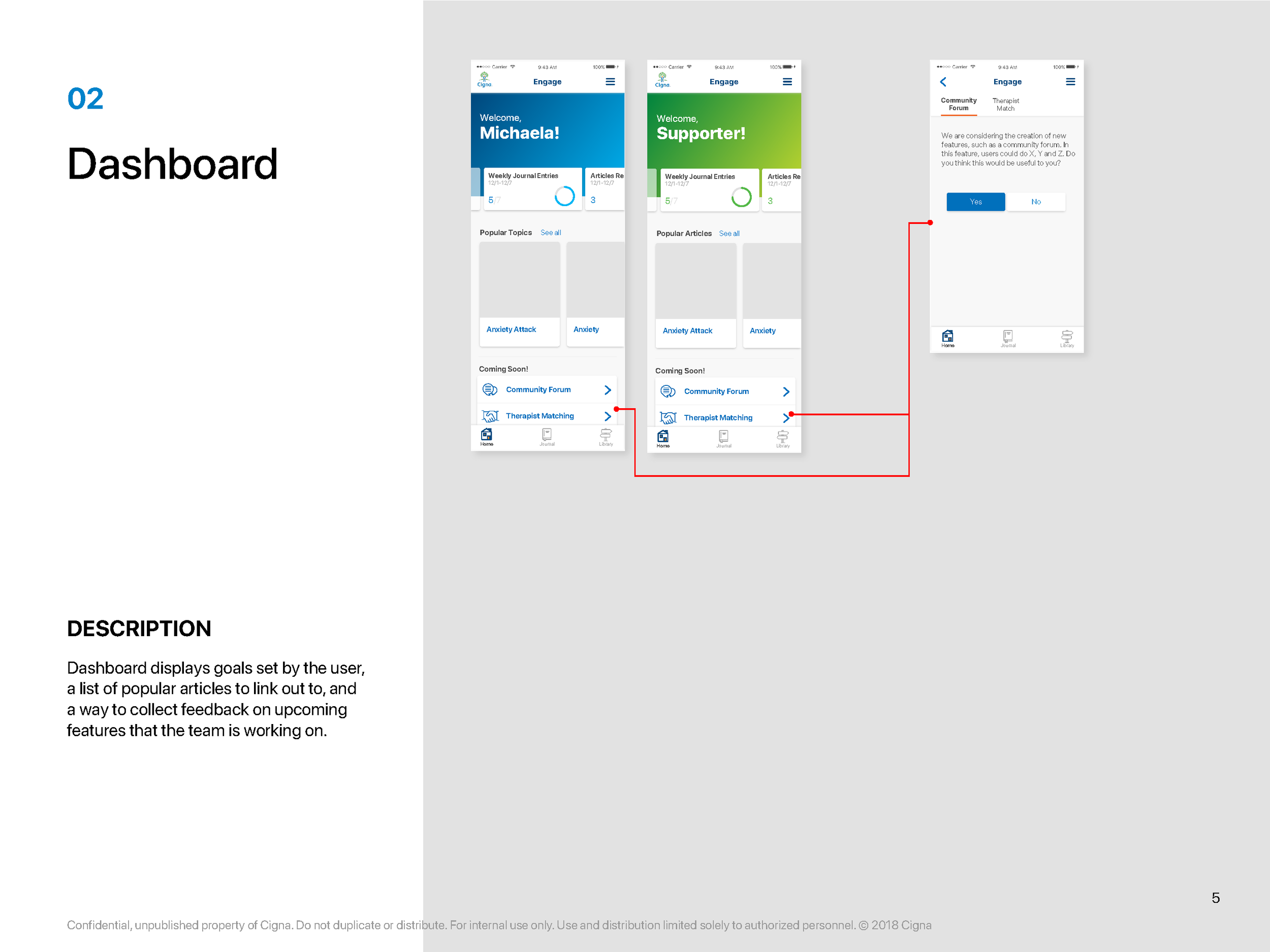
Home page — Creating a clear, calming entry point that orients users without overwhelming them
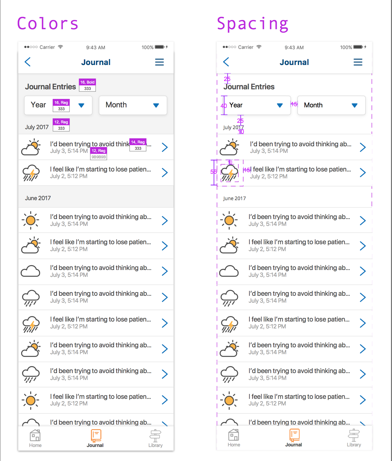
Journal — Designing a low-barrier, private-feeling experience that encourages consistent use
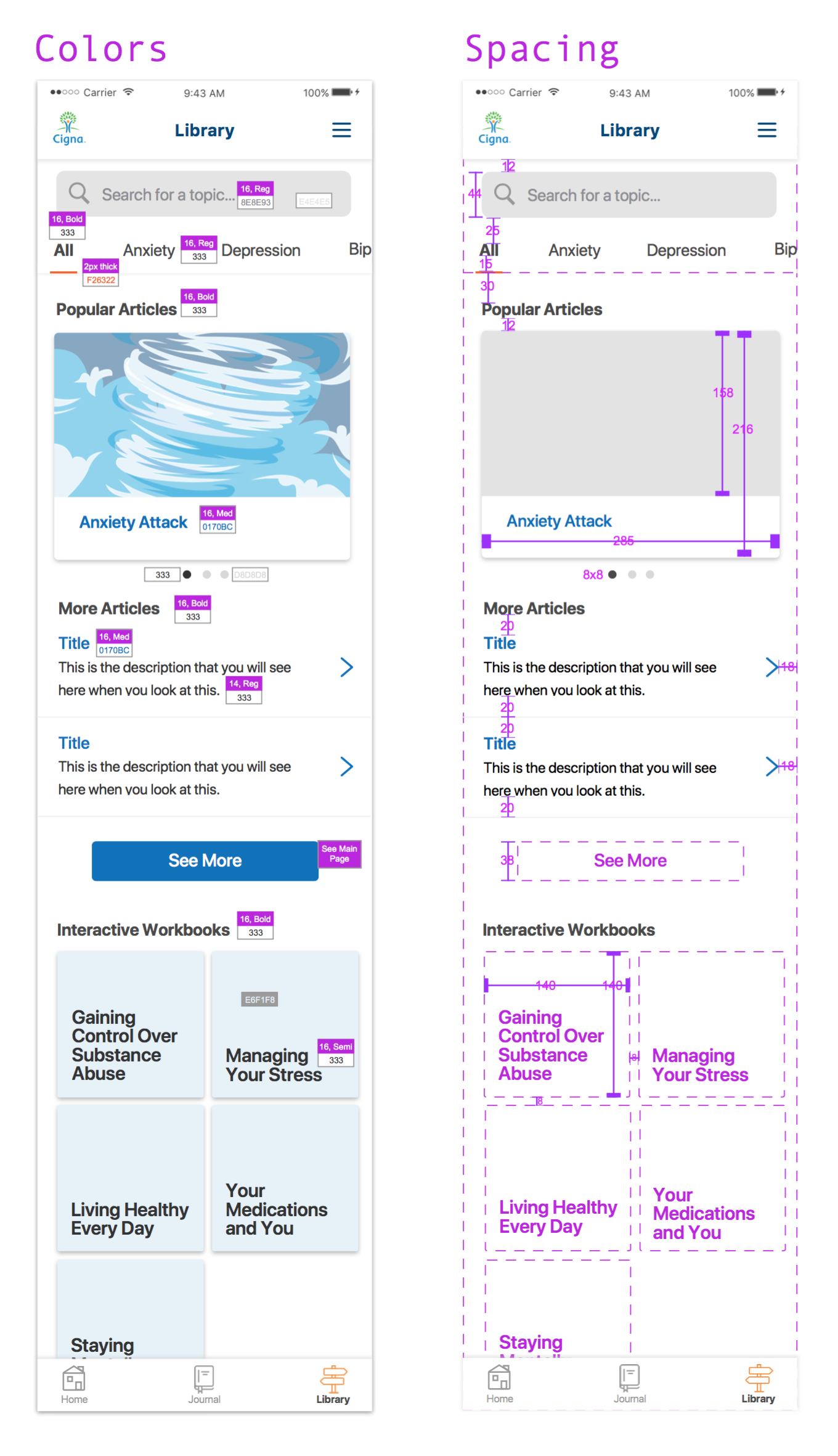
Library — Organizing complex health information in a way that's scannable and non-clinical in tone
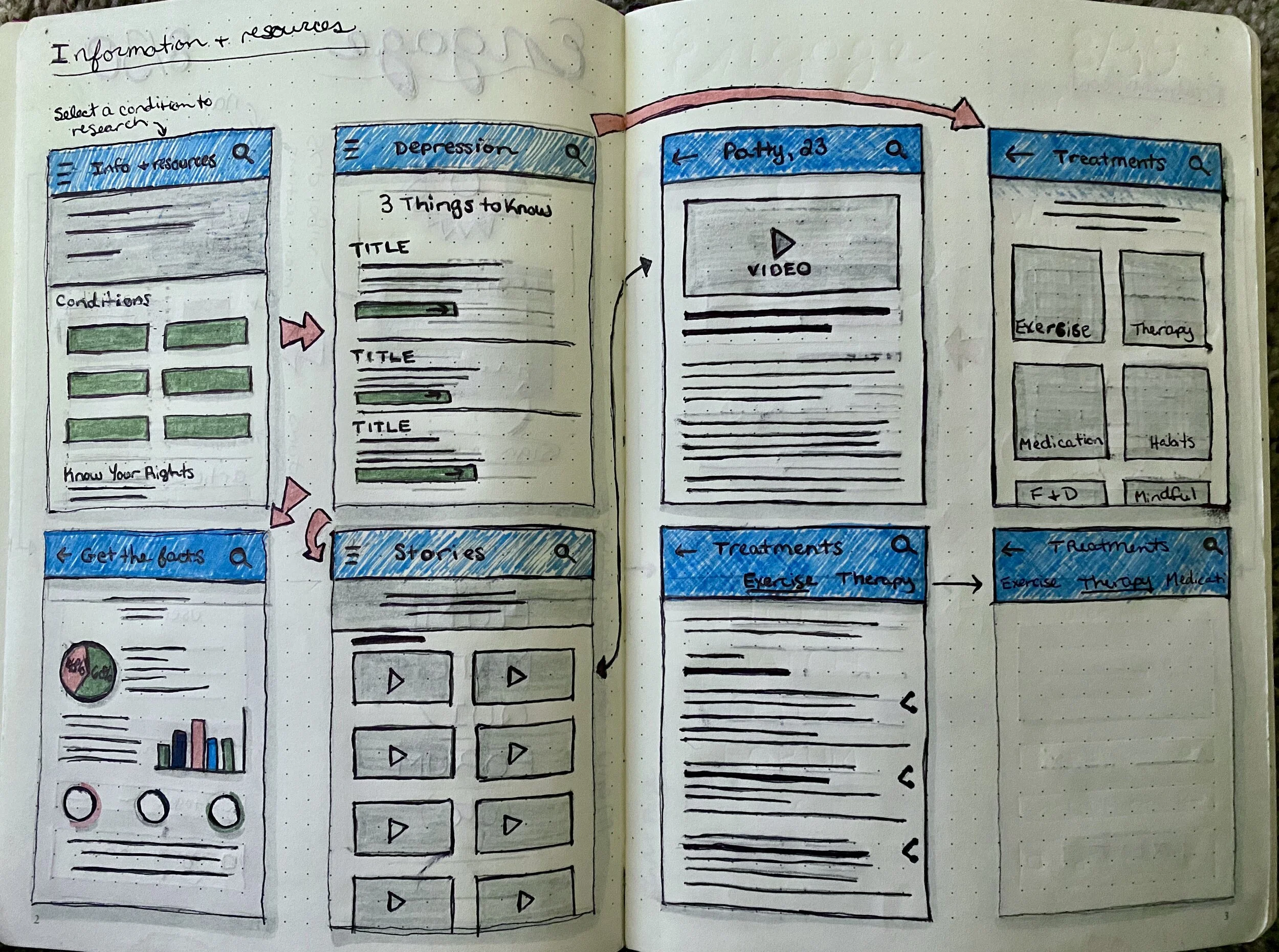
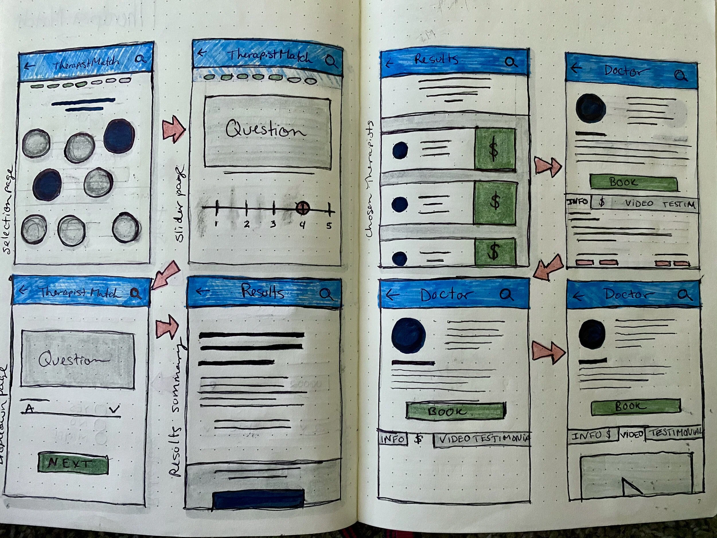
Early design wireframesDesign Direction: The Weather Metaphor
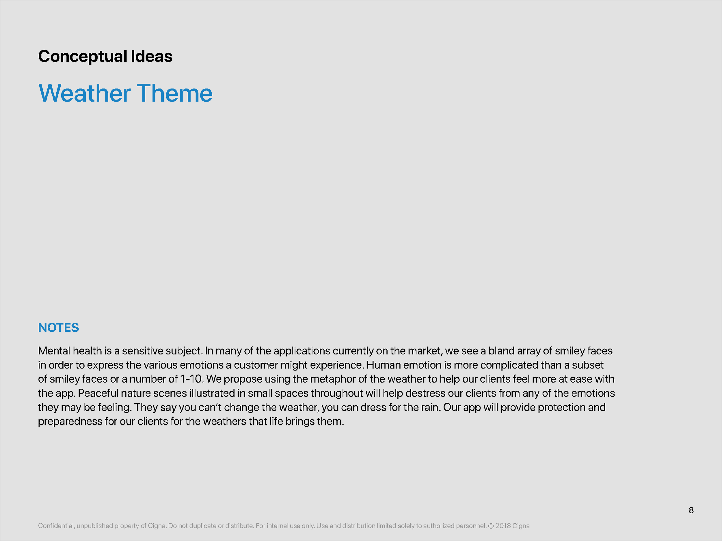
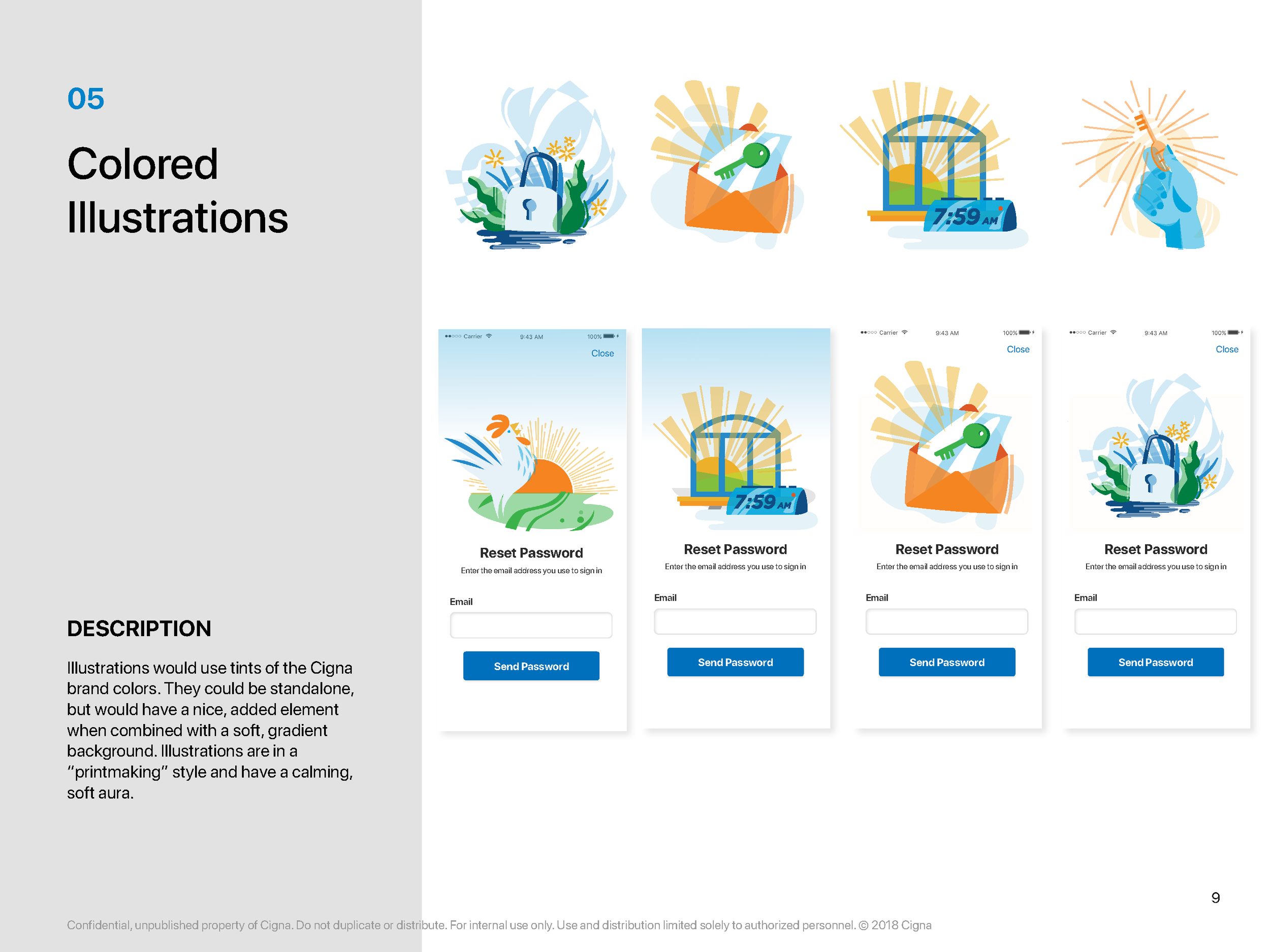
One of the most deliberate design decisions on this project was the visual and conceptual theme.
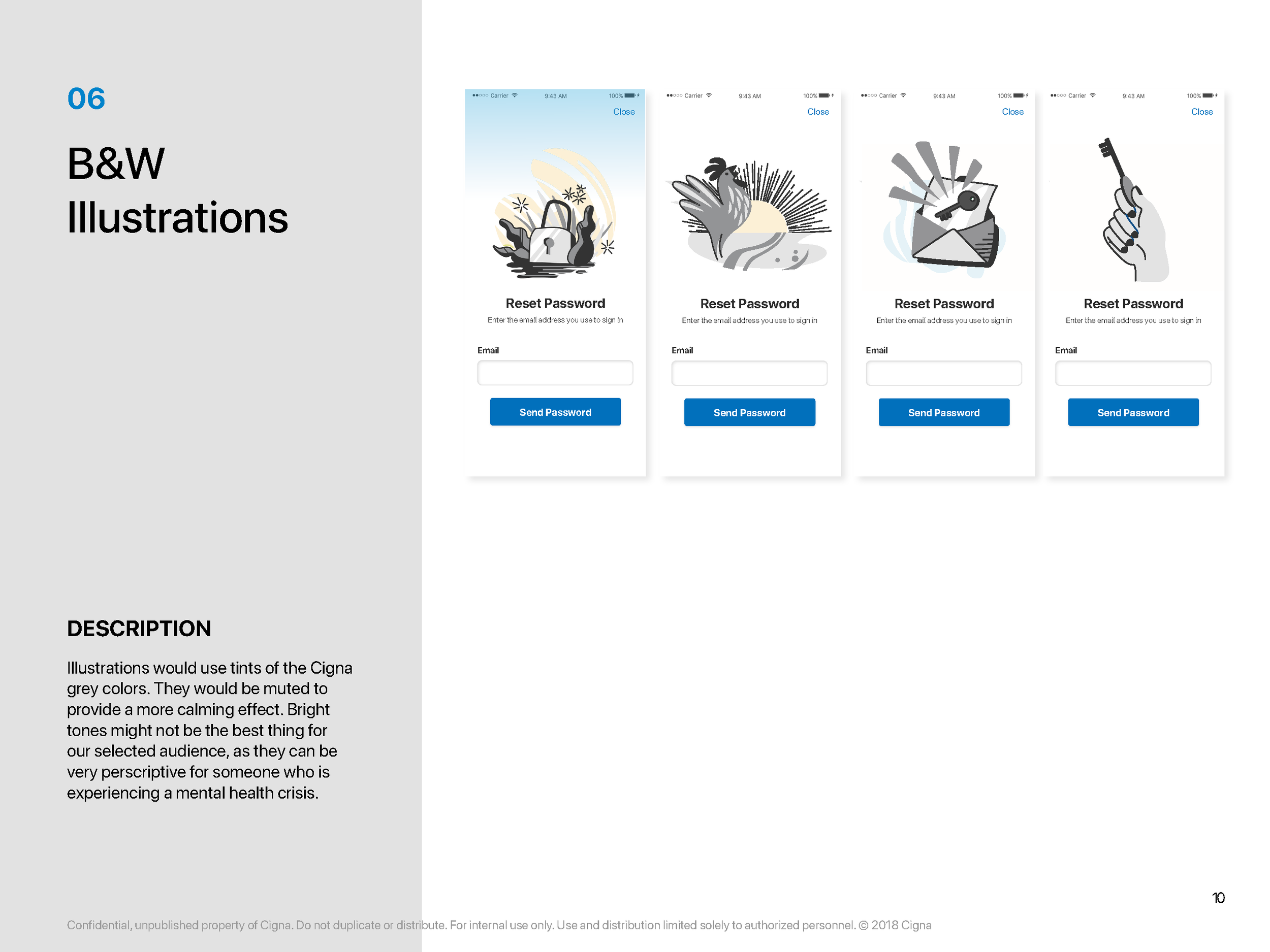
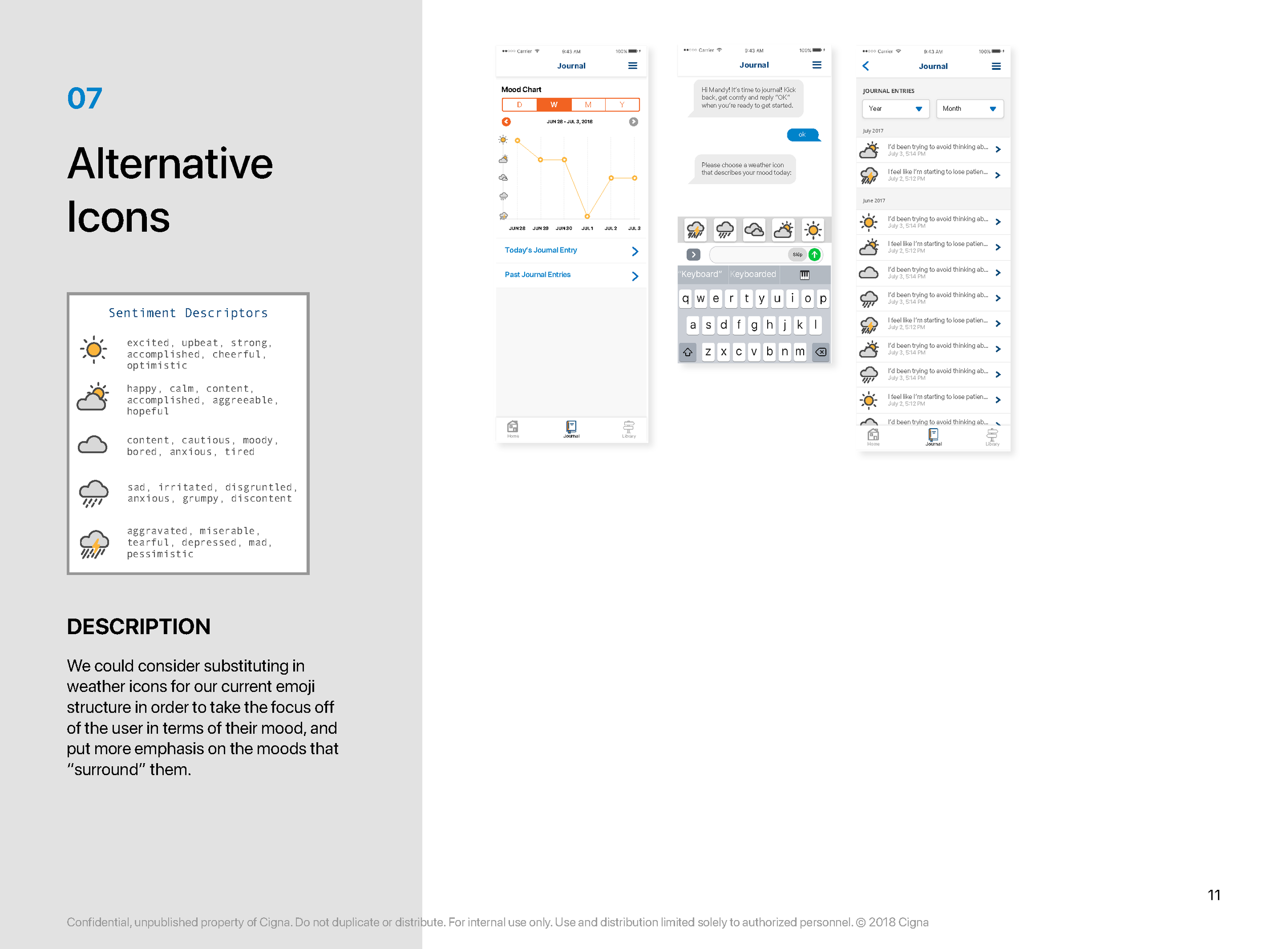
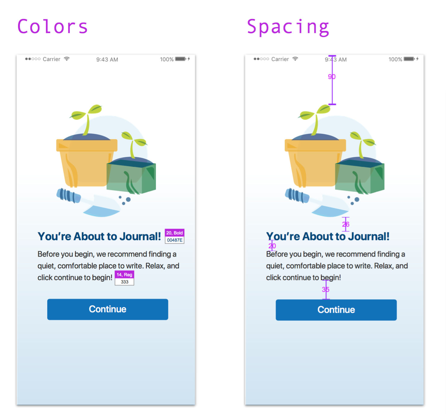
Most mental health apps lean on the same narrow vocabulary — smiley face scales, sliding meters, clinical color palettes. For an audience already wary of stigma, these conventions can feel reductive or alienating. I proposed a different approach: using weather as a metaphor for emotional states.
The reasoning was grounded in both accessibility and empathy. Weather is universally understood, emotionally resonant, and carries no clinical baggage. The concept drew on the idea that you can't change the weather, but you can dress for the rain — a reframe that acknowledges difficulty without pathologizing it. Paired with peaceful nature scenes and a warm visual palette, the goal was an app that felt like a place users would actually want to return to.
This extended beyond aesthetics. The metaphor gave the entire design system a coherent emotional logic — one that could scale to new features without losing its tone.
A presentation created to walk our Brand team through the project objectives.Communication & Cross-Functional Collaboration
Bringing this to life required coordination across Brand, Legal, and the development team simultaneously. To keep everyone aligned without adding meeting overhead, I created a suite of documents and presentations tailored to each audience — translating design decisions into language that resonated with legal reviewers, brand stakeholders, and developers alike.
Clear communication was especially critical given the regulatory surface area. HIPAA and FERPA requirements meant certain features couldn't advance without sign-off, so I designed with modularity in mind — keeping the team unblocked while flagging what was contingent on compliance review.
A selection of pages from version 5 of my redlining document.Testing & What We Learned
The application underwent internal Alpha testing with 14+ participants, and the feedback was meaningfully useful — not just validating.
Users responded positively to the core features but flagged a specific UX problem with the journal that reshaped our approach. The business team had advocated for a text conversation-style visual for the journal summary view. In testing, users found this format misleading. What they actually wanted was to see their specific questions alongside their answers — context that the conversational format stripped away.
We had previously attempted to stitch journal responses into flowing prose entries, but this created its own problem: we couldn't predict how users would phrase their answers, which led to summaries that read as incoherent or incomplete. The testing confirmed what the design team suspected — structured clarity beat conversational aesthetics for this use case.
This is the kind of finding that only emerges from real testing with real users, and it's a good example of why Alpha testing is worth the investment even on a proof-of-concept.
Challenges
Several structural challenges shaped the project's trajectory.
Our business partners were enthusiastic about the outcome but less familiar with the realities of application development. Requirements that had been stable shifted unexpectedly close to launch — most significantly, a late decision to require insurance account authentication at registration, reversing an earlier agreement that the app would be publicly accessible. This added development complexity and pushed the launch timeline.
Beta testing was also impacted. We had requested that business partners identify a pool of pilot participants in advance. That list never materialized in time, which limited the testing pool and the quality of feedback we could gather before launch.
These weren't uncommon challenges on a proof-of-concept — but they were instructive.
Outcome
Engage was ultimately suspended due to a combination of insufficient business partner engagement and the strategic disruptions caused by the Covid-19 pandemic. Internally, it was considered a success — the application met all established requirements, passed Alpha testing, and demonstrated a viable design direction for a genuine gap in the market.
The most durable lesson from the project wasn't technical. It was about partnership. A proof-of-concept requires equal investment from every stakeholder — not just the build team. When that investment is uneven, the gap between a compelling prototype and a production-ready product becomes very difficult to close.
What Came Next
Engage's impact didn't stop when the project was paused. The work we did — and the mental health focus we'd developed — directly influenced what came next. Cigna asked our team to repurpose the existing Fitness Challenge platform into a Resilience Challenge for January 2021, adapting it to prioritize overall wellbeing and encourage healthy behaviors through structured wellness tasks.
The Resilience tasks were well-received and subsequently incorporated into the renamed Global Wellness Challenge — where they've continued to reach users around the world.
The project may have been paused. The thinking behind it carried forward.