IntelliDrive Renewal Estimate: Designing a Tool That Makes the Invisible Visible
Turning a spreadsheet into a tool a CSR can actually trust mid-call.
Role: Senior Experience Design Lead
Tool type: Internal CSR-facing web tool
Program: IntelliDrive 365, Travelers PI
Timeline: 2023 - Ongoing (Day 3 in progress)
Background
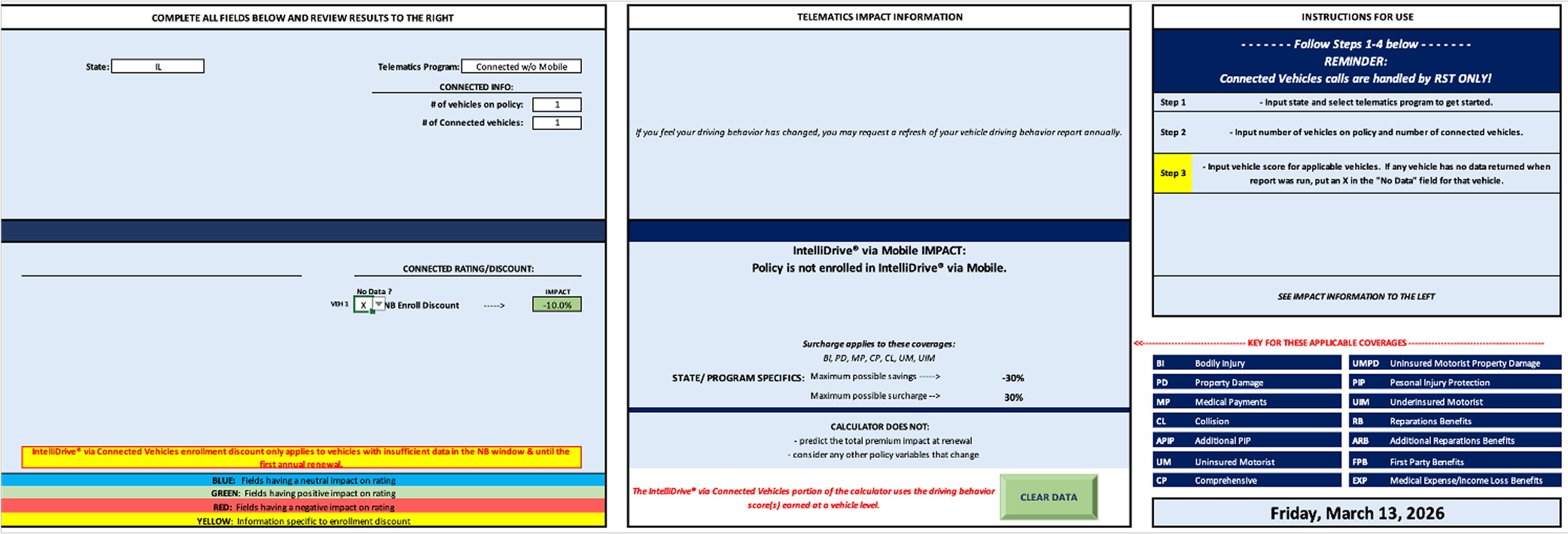
IntelliDrive 365 is Travelers Insurance’s continuous telematics program. Customers earn discounts — or absorb surcharges — based on their driving behavior over a full six-month policy term. When renewal approached, customers would call in asking what their driving score meant for their premium. Customer Service Representatives had no reliable way to answer. The only existing tool was an Excel spreadsheet — emailed to CSRs periodically, manually filled out, instantly stale, with no logic for trip corrections, score rolloffs, or participation discounts. The color-coded cells were the UX.
The result was a reactive, uncertain renewal conversation. CSRs couln’t lead with data because they didn’t have any. The gap wasn’t just operational — it was eroding trust in the product at exactly the moment that trust mattered most: renewal.
The One-Line Version
When a customer calls to ask why their renewal premium changed, a CSR needs to be able to answer that question confidently, in real time, with accurate data. Before this tool existed, they couldn’t.
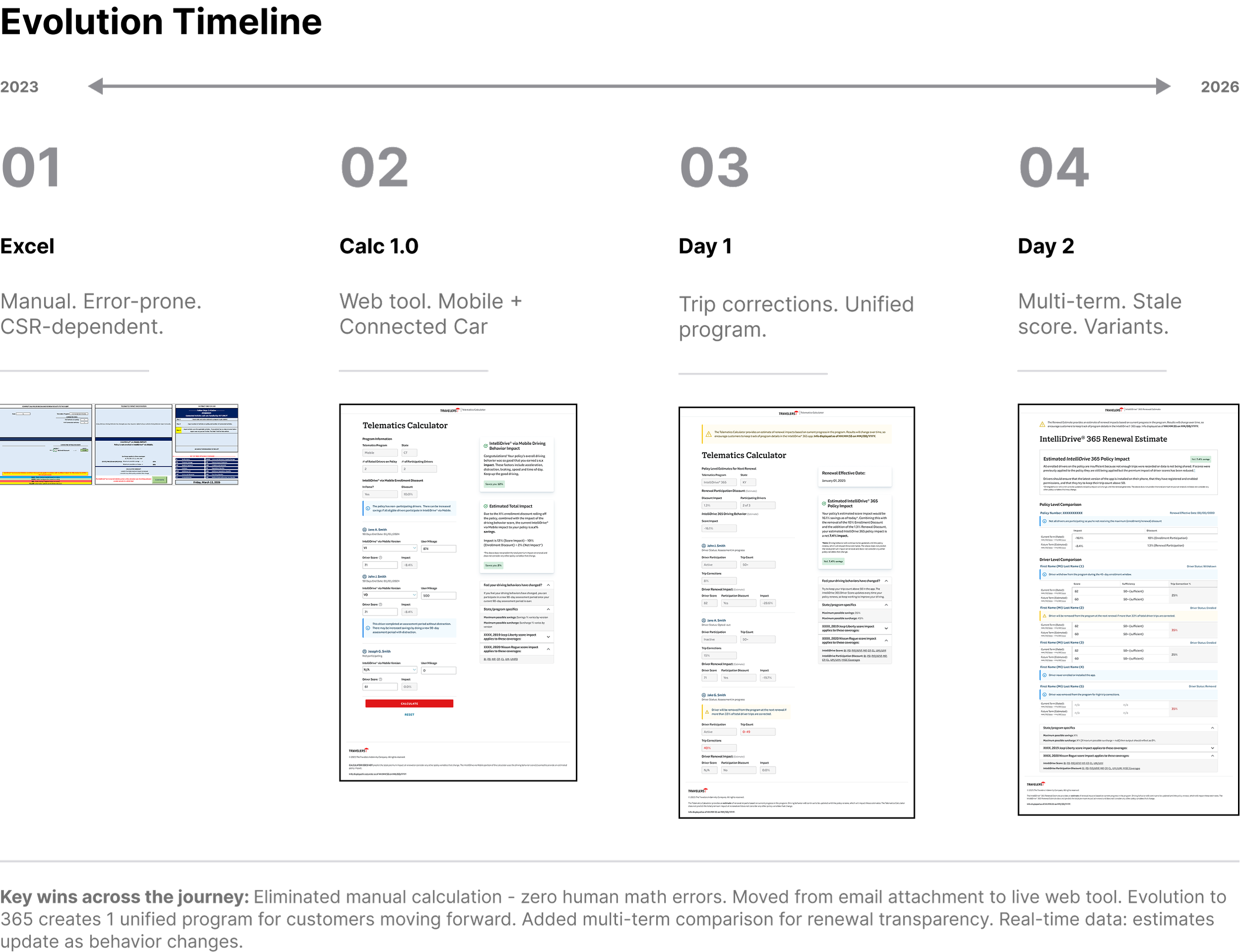
Where We Started: The Excel Problem
The CSR is the user, but the customer is always in the room. Every design decision had to serve two people at once: the CSR who needs to navigate the tool quickly and confidently mid-call, and the customer on the other end who needs the output to feel clear, fair, and trustworthy.
That dual audience shaped every constraint: the tool needed to be fast to read, impossible to misuse, legally precise, and accessible enough that a CSR could explain what they were seeing out loud without the customer needing to see the screen.
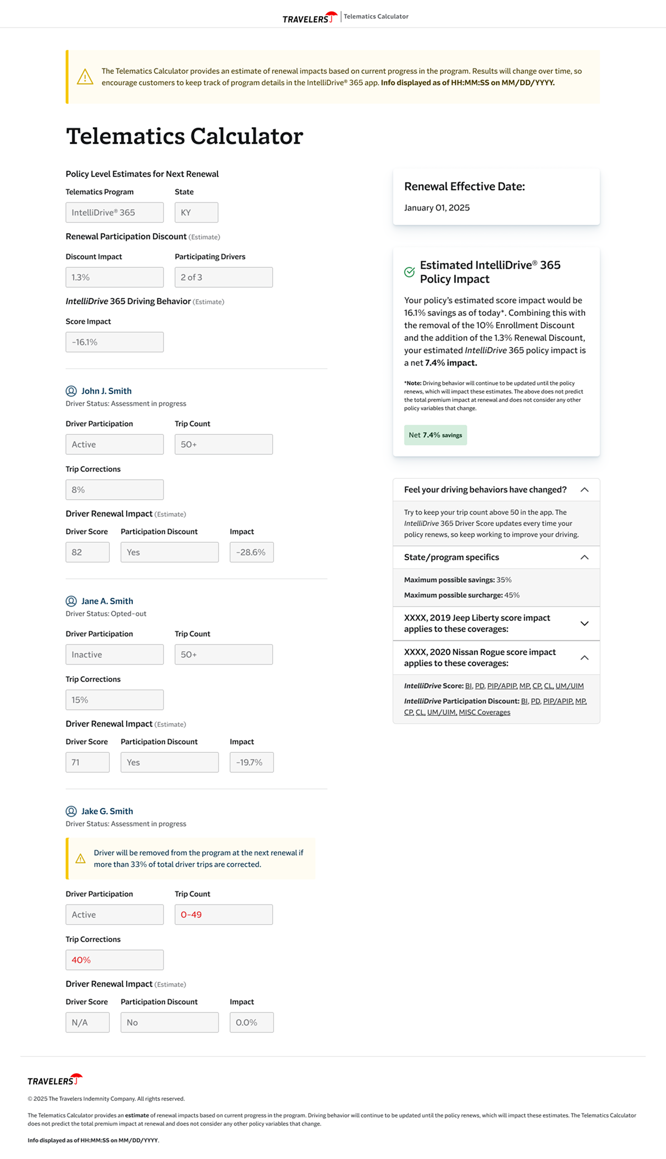
Version 1.0: Replacing the Spreadsheet
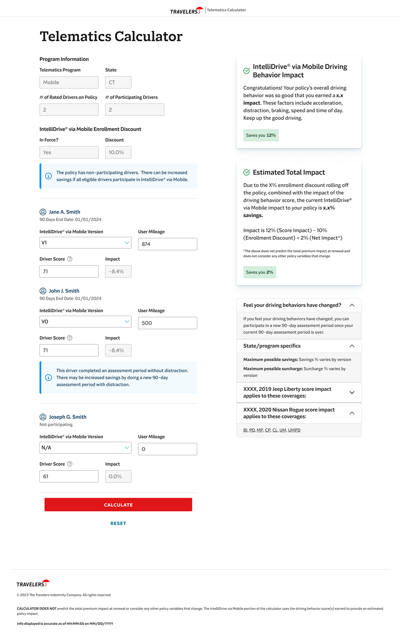
The first build moved the tool from an email attachment to a live web application. For the first time, CSRs had pre-populated program data for Mobile IntelliDrive participants, driver score input fields that translated directly into impact percentages, enrollment discount logic that calculated automatically, and a clean Calculate/Reset interaction that made the tool feel usable mid-call.
It was a meaningful step. But it had a real liability: the architecture still allowed CSRs to manually adjust variables. That was both a legal risk and a design problem — if a tool can produce different outputs depending on what the user enters, it can produce wrong outputs. Version 1.0 proved the concept. It also made the next design problems obvious.
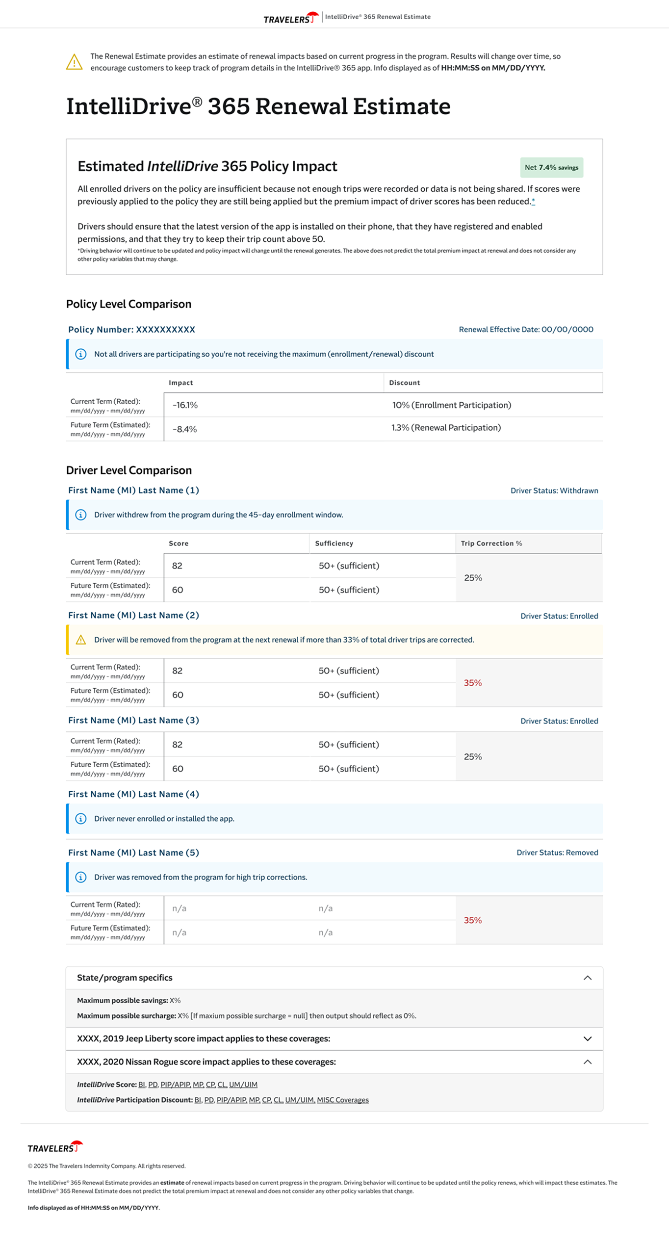
Day 1: Removing Human Error From the Equation
The shift from Telematics Calculator to the IntelliDrive Renewal Estimate wasn’t just a rename. It reflected a fundamental change in the design approach: the CSR should not be entering data. The data should come to them.
Day 1 connected the tool to live driving behavior data. Driver scores populated automatically. Mileage sufficiency — whether a driver had logged enough trips for their score to count — was surfaced as a clear flag rather than a buried calculation. Participation discounts were broken out separately from enrollment discounts, because conflating them had been a consistent source of CSR confusion. The renewal effective date appeared on every estimate, grounding the conversation in a specific moment rather than a hypothetical.
The before/after was stark: CSRs had gone from manually entering score values to receiving a complete, accurate picture of a customer’s telematics profile in a single view. The margin for human error dropped to near zero.
Day 2: Designing for the Cases That Actually Happen
An MVP works when the customer in front of you fits the expected scenario. Real renewal calls don’t work that way.
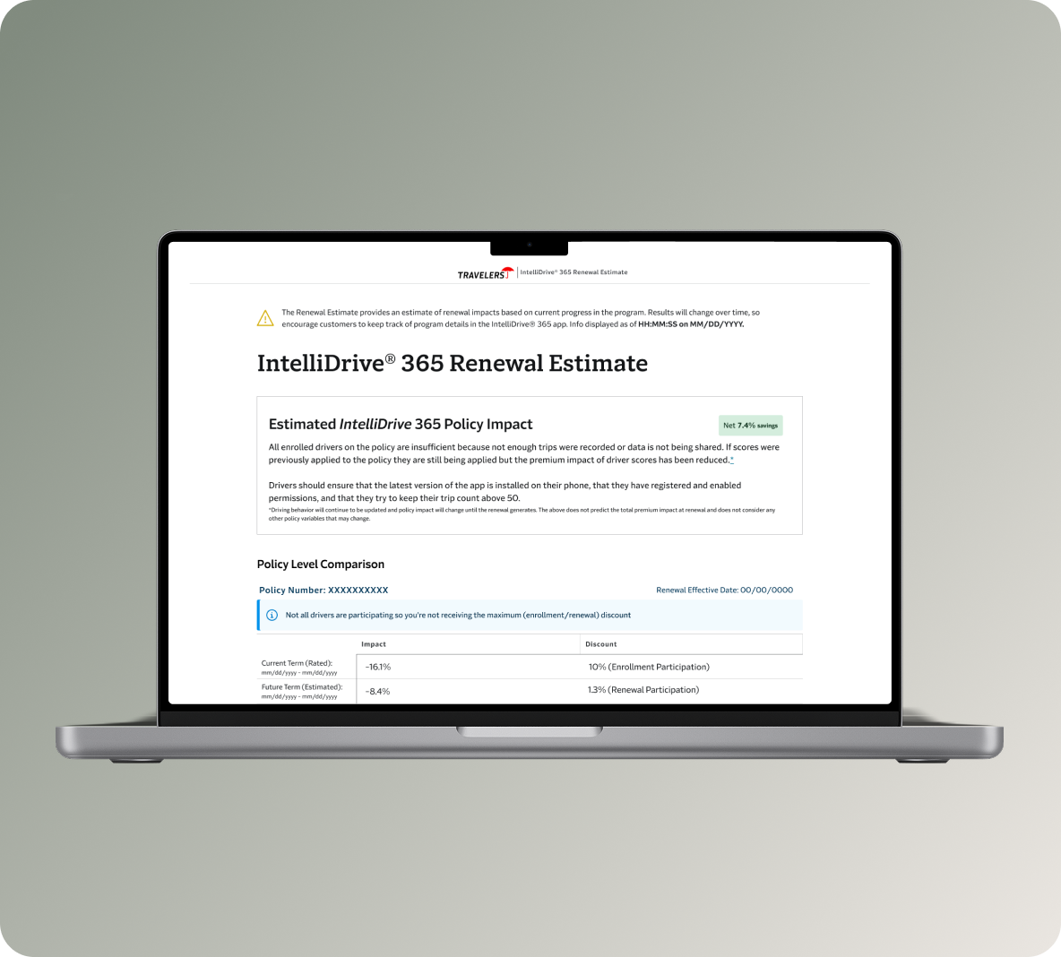
Day 2 was about handling edge cases that make up a significant portion of actual volume: customers with multiple terms whose rated history could be shown side-by-side, drivers with stale scores whose data hadn’t refreshed, and customers in states where only savings apply — where the surcharge logic doesn’t exist and the messaging has to reflect that.
The hardest design problem was the 2+ Terms layout. It had to show two simultaneous timeframes — the current rated term and the upcoming estimated term — for every driver on a policy, while surfacing each driver’s score, mileage sufficiency, trip correction percentage, and participation status. Driver statuses could be any combination of enrolled, withdrawn, opted-out, removed, or never enrolled. The 33% trip correction threshold — the point at which a driver risks removal at the next renewal — needed to be visible as a warning, not buried in a footnote.
All of this had to be readable mid-call, explainable out loud, and accurate enough to stand up to legal review.
The messaging layer added another dimension of complexity. The policy-level impact summary couldn’t be a single message — it had to be contextually correct for every combination of term state, data quality, and participation scenario. Savings showed in green and reinforced the value of staying enrolled. Surcharges required careful framing — the tone of how a CSR delivers bad news about a premium increase is a design problem, not just a copy problem. Insufficient data, stale scores, and discount-only states each required distinct messages, because conflating them would have caused CSRs to give customers inaccurate explanations. And any of those scenarios could combine — a stale score in a discount-only state is a different situation than either one alone.
Legal reviewed every string. Word choices, tense, and qualifiers were non-negotiable in many cases. The design had to accomodate that constraing while still producing copy that a CSR could read naturally.
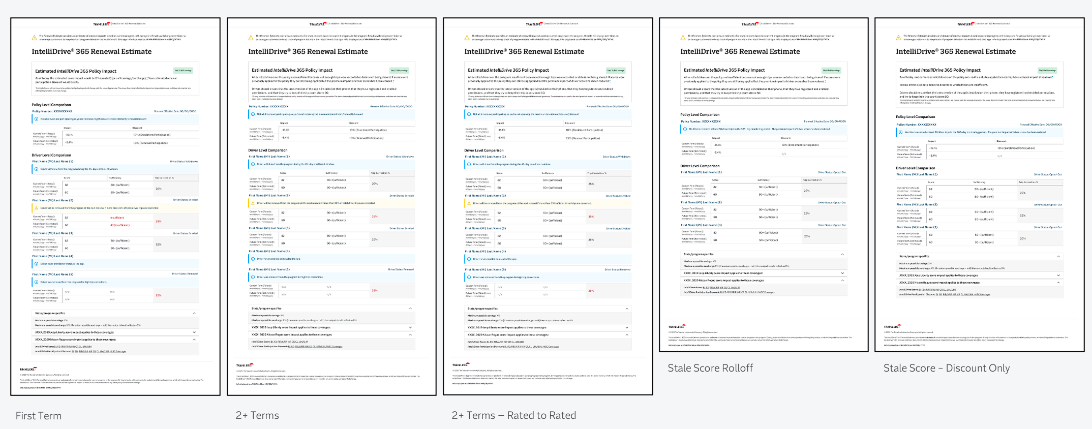
All applicable scenarios
Day 3: Where We’re Going
The tool works. Day 3 is about precision and reducing the ongoing CSR training burden.
Driver status definitions — previously deferred by development due to tooltip complexity — are being redesigned as inline anchor links, so a CSR can access a clear definition mid-call without leaving the tool. Each discount type will have the same treatment, which addresses a recurring source of confusion about why discounts shift between terms. Expanded warning and info states will give CSRs more descriptive context for edge conditions, with the goal of reducing escalations and back-office inquiries. Trip correciton percentage for both terms is in active discussion pending actuarial alignment.
The Through-Line
The evolution from Excel spreadsheet to the current tool follows a single design principle: every iteration transferred complexity away from the CSR and into the system. Version 1.0 replaced manual form-filling with a web tool. Day 1 replaced manual score entry with live data. Day 2 replaced scenario guessing with explicit layouts for every meaningful edge case. Day 3 will replace implicit knowledge — the kind CSRs currently have to carry in their heads — with in-context definitions and descriptions.
The customer never sees this tool. But they can feel the difference between a CSR who has to estimate and hedge, and a CSR who can say with confidence: here’s what your driving behavior means for your renewal, and here’s exactly why.
Result and Reflections
This project is a good example of what design looks like when the problem isn’t visual. There are no brand moments here, no consumer-facing delight — just a complex information architecture problem that needed to be solved well enough that a CSR could trust it mid-call and a customer could feel the difference on the other end of the phone.
The work that’s easy to overlook is the messaging layer. Writing conditional copy that had to be legally precise, tonally appropriate for both good and bad news, and readable out loud required the same rigor — maybe more — because the cost of getting it wrong wasn’t visual, it was a customer receiving an inaccurate explanation of their own premium.
What I’d point to as the clearest signal of design impact here isn’t any single screen. It’s the trajectory: each iteration made the tool more trustworthy by removing a layer of human dependency. That’s a design outcome, even when the mechanism is logic, data, and copy rather than color and composition.